New task! Teams where swapped around and for the first time since week 1, I have been split up with Rebecca! 😦
New team is:
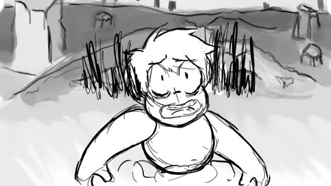
The new world is the “Sound World”. This world is a microscopic planet that moves on soundwaves. I was in this world in week 1 and it has come along way. Each team has added more elements and characters. I love the main character “Equaliser”. She is a female character that can’t seen to find the type of music that she likes.
 ‘Equaliser’ from Kirsten’s Blog: https://kirdraws.wordpress.com/
Research
We wanted to look at as much movie opening sequences that we could to give us an idea and inspiration on what we could do with ours. From previous teams the characters have been created using basic shapes, such as squares, circles and cubes.
Below is the title sequence for ‘Monsters Inc’. We liked how they used simple shapes and doors to interact with the text. It is colourful and fun to watch, not just typical writing popping up on the screen.
‘Hotel Transylvania’ credit scene is so fun to watch. They have the characters in 2D that are interacting with the text. The colour scheme is simple with a red background and white font, but with the character movement it is certainly not boring. They are telling a story on their own, it makes you want to watch all the credits (and who ever does that?). The music is a song by Becky G -Problem ft Will.i.am. It is upbeat, which follows the ending scene of the movie (A Party). Again this would make staying for the credits more probable if you like the song.
I looked at Shawn of the Dead Title Sequence. This is hilarious. The movie itself is live action but the opening is animated. The audience can tell straight away that this movie is a comedy. The style is also like silhouettes or shadow puppets and the characters have a cartoon style. Colours have been kept to a minimum, with red being the only vibrant one (resembling blood). The music is quirky and fits the comedy theme.
This is one Megan came across. It is the opening title sequence of ‘Catch me if you can’. It’s very smartly done. Even though it is for a live action movie the sequence is animated and tells a story. The text has a uniqueness to it by using lines expanding from the letters, its like the text is part of the scene. Such as a wall, a door or even road markings. The colours are fairly minimal although they do change throughout, there would only be two colours to each scene. The music gives a mysterious feeling, like someone is up to mischief.
‘Lemony Snicket’s A series of Unfortunate Events’ is amazing. I absolutely love the style and art work in this. It is pretty long for an opening title, over 5 minutes, but its so easy to sit and watch it all. The way the style looks like cardboard cut outs and how they have used the text with the movement. It shows the three main characters and tells a story as they move throughout. The colour scheme is very dark and eerie aswell as the music.
